Note: This article was originally published on my personal blog. For more updates, follow me on Twitter @ibelick.
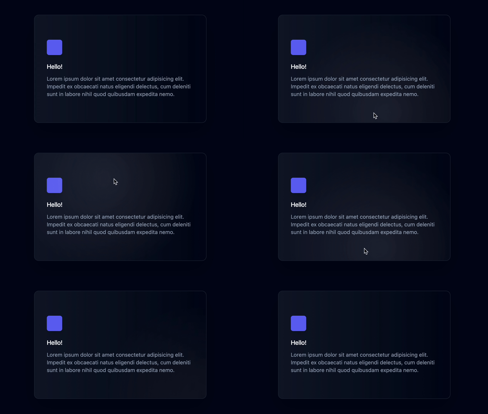
Recently, the spotlight effect has been increasingly popular in modern websites and apps, adding a touch of interactivity and delight to various elements, such as cards. This visually appealing effect draws users’ attention to specific areas on a page, making the user interface more dynamic and engaging.
In this article, we’ll explore how to create a modern spotlight effect using React + Tailwind CSS / vanilla CSS, and demonstrate how you can easily implement it in your own projects. Let’s dive in!
The components
React + TailwindCSS
export const CardSpotlightEffect = () => {
  const divRef = useRef<HTMLDivElement>(null);
  const [isFocused, setIsFocused] = useState(false);
  const [position, setPosition] = useState({ x: 0, y: 0 });
  const [opacity, setOpacity] = useState(0);

  const handleMouseMove = (e: React.MouseEvent<HTMLDivElement>) => {
    if (!divRef.current || isFocused) return;

    const div = divRef.current;
    const rect = div.getBoundingClientRect();

    setPosition({ x: e.clientX - rect.left, y: e.clientY - rect.top });
  };

  const handleFocus = () => {
    setIsFocused(true);
    setOpacity(1);
  };

  const handleBlur = () => {
    setIsFocused(false);
    setOpacity(0);
  };

  const handleMouseEnter = () => {
    setOpacity(1);
  };

  const handleMouseLeave = () => {
    setOpacity(0);
  };

  return (
    <div
      ref={divRef}
      onMouseMove={handleMouseMove}
      onFocus={handleFocus}
      onBlur={handleBlur}
      onMouseEnter={handleMouseEnter}
      onMouseLeave={handleMouseLeave}
      className="to-slate-950 relative max-w-md overflow-hidden rounded-xl border border-slate-800 bg-gradient-to-r from-slate-900 px-8 py-16 shadow-2xl"
    >
      <div
        className="pointer-events-none absolute -inset-px opacity-0 transition duration-300"
        style={{
          opacity,
          background: `radial-gradient(600px circle at ${position.x}px ${position.y}px, rgba(255,255,255,.06), transparent 40%)`,
        }}
      />
      <span className="mb-4 inline-flex items-center justify-center rounded-md bg-indigo-500 p-2 shadow-lg">
        <svg
          className="h-6 w-6 text-white"
          xmlns="http://www.w3.org/2000/svg"
          fill="none"
          viewBox="0 0 24 24"
          stroke="currentColor"
          aria-hidden="true"
        />
      span>
      <h3 className="mb-2 font-medium tracking-tight text-white">Hello!h3>
      <p className="text-sm text-slate-400">
        Lorem ipsum dolor sit amet consectetur adipisicing elit. Impedit ex
        obcaecati natus eligendi delectus, cum deleniti sunt in labore nihil
        quod quibusdam expedita nemo.
      p>
    div>
  );
};
The component utilizes state variables to manage the spotlight’s position, opacity, and focus state.
Event handlers are defined for the following scenarios:
- Mouse movement (
handleMouseMove): Update the spotlight’s position based on the mouse coordinates relative to the card.
Focus (handleFocus) and blur (handleBlur): Manage the spotlight’s visibility by adjusting its opacity when the card gains or loses focus. - Mouse entering (
handleMouseEnter) and leaving (handleMouseLeave): Make the spotlight visible only when the mouse is inside the card area. - The component renders a div element representing the card, and another div inside it to create the spotlight effect using a radial gradient background. The spotlight effect follows the mouse as it moves over the card, creating a dynamic and interactive appearance.
React + CSS
If you don’t want to use Tailwind CSS, you can use the following CSS to achieve the same effect.
import React, { useRef, useState } from "react";
import "./CardSpotlightEffect.css";

export const CardSpotlightEffect = () => {
  const divRef = useRef(null);
  const [isFocused, setIsFocused] = useState(false);
  const [position, setPosition] = useState({ x: 0, y: 0 });
  const [opacity, setOpacity] = useState(0);

  const handleMouseMove = (e) => {
    if (!divRef.current || isFocused) return;

    const div = divRef.current;
    const rect = div.getBoundingClientRect();

    setPosition({ x: e.clientX - rect.left, y: e.clientY - rect.top });
  };

  const handleFocus = () => {
    setIsFocused(true);
    setOpacity(1);
  };

  const handleBlur = () => {
    setIsFocused(false);
    setOpacity(0);
  };

  const handleMouseEnter = () => {
    setOpacity(1);
  };

  const handleMouseLeave = () => {
    setOpacity(0);
  };

  return (
    <div
      ref={divRef}
      onMouseMove={handleMouseMove}
      onFocus={handleFocus}
      onBlur={handleBlur}
      onMouseEnter={handleMouseEnter}
      onMouseLeave={handleMouseLeave}
      className="card-spotlight-effect"
    >
      <div
        className="spotlight"
        style={{
          opacity,
          background: `radial-gradient(600px circle at ${position.x}px ${position.y}px, rgba(255,255,255,.06), transparent 40%)`,
        }}
      />
      <div>
        <span className="icon">{/* SVG icon here */}span>
      div>
      <h3 className="greeting">Hello!h3>
      <p className="description">
        Lorem ipsum dolor sit amet consectetur adipisicing elit. Impedit ex
        obcaecati natus eligendi delectus, cum deleniti sunt in labore nihil
        quod quibusdam expedita nemo.
      p>
    div>
  );
};
.card-spotlight-effect {
  position: relative;
  max-width: 24rem;
  overflow: hidden;
  border-radius: 0.875rem;
  border: 1px solid #374151;
  background-image: linear-gradient(to right, #0f172a, #06171b);
  padding: 4rem 2rem;
  box-shadow: 0 25px 50px -12px rgba(0, 0, 0, 0.25);
}

.spotlight {
  pointer-events: none;
  position: absolute;
  inset: -1px;
  opacity: 0;
  transition: opacity 300ms;
}

.icon {
  display: inline-flex;
  align-items: center;
  justify-content: center;
  background-color: #3b82f6;
  padding: 0.5rem;
  border-radius: 0.5rem;
  box-shadow: 0 10px 15px -3px rgba(0, 0, 0, 0.1), 0 4px 6px -2px rgba(0, 0, 0, 0.05);
}

.greeting {
  margin-top: 1.25rem;
  font-size: 1rem;
  font-weight: 500;
  text-transform: uppercase;
  color: #ffffff;
}

.description {
  margin-top: 0.5rem;
  font-size: 0.875rem;
  color: #6b7280;
}
In this article, we’ve explored how to create a modern and engaging spotlight effect using React and CSS. By implementing this effect in your websites or apps, you can add a layer of interactivity that captures users’ attention and elevates the overall user experience.
Remember, the spotlight effect isn’t limited to just cards; you can apply it to various elements, such as input fields or buttons, to make your interface more dynamic and visually appealing. If you’re interested in learning more about interactive effects, check out my previous article on
Creating an interactive spotlight border with CSS and React.
Feel free to experiment and adapt the techniques discussed in this tutorial to fit your specific design needs and preferences.


