A couple of week’s ago I asked on Twitter about good blogging platforms for developers. Aside from quite a few suggestions to build one myself with 11ty (which I may get to eventually) the two main contenders were Hashnode and Dev.to, but since accessibility is my jam in order to help me decide between the two I did some accessibility testing on both to see which has the better experience.
It may be a giveaway which platform won in my view, considering where I’m writing this, but here is the process I went through to decide. If you’d rather watch a video I also posted a review on Youtube. Otherwise, read on…
(Sidenote: the youtube video was filmed in February and some changes have been made to the sites since then. Some numbers/issues might have been fixed since then as I’m retesting as I write this blog post.)
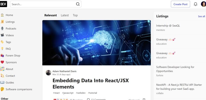
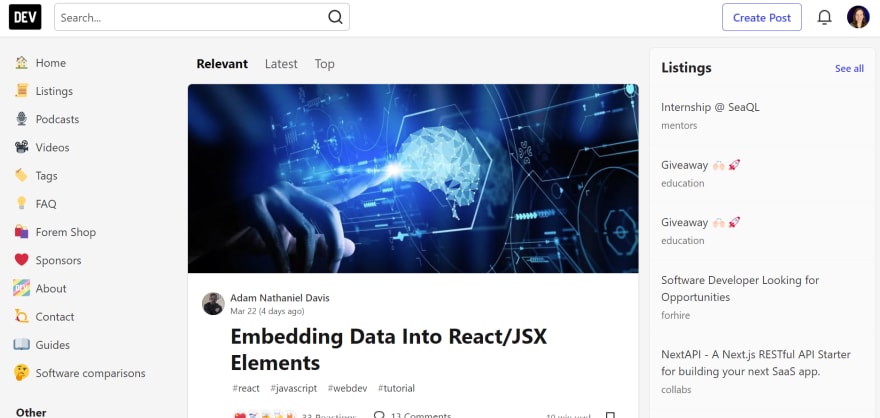
The two sites are visually similar, with a header containing things like logo and search, a left sidebar containing navigation items, a central feed of blog posts and a right sidebar with things like statistics, trending search terms and challenges.
Automatic testing
First, I did some automatic testing with the chrome extension Axe Dev Tools. I was pleasantly surprised by the low score both websites had.
Dev.to scored 21 last month and is down to 15 today and Hashnode scored 15 last month and 17 today. The issues flagged were very similar. Both had id attribute values that were not unique, a few color contrast issues, problems with alternative text on some images and links or buttons without discernable text. Dev.to also had headings that increased by more than one level and Hashnode had frames missing accessible names. However, it’s great to see that the score is decreasing on Dev.to.
Keyboard testing
Since automatic testing can only find around a third of accessibility issues, I continued by testing both sites with the keyboard. Starting at the top of the page I tabbed through the content and here is where the first major differences started to show up.
Previously testing Dev.to there seemed to be some hidden link before the Dev.to logo at the top of the page. I guessed it was a skip link that just wasn’t visible. Great to see when I returned today that the skip link actually shows up on the page when you tab to it!
On the whole, focus indicators are clear and easy to follow around the screen. I only lost it a couple of times in a sidebar component about the Dev Community. However, the main downside with keyboard use is that for each card in the main feed there are way too many tab stops. I counted 15 on the top card alone. And then there’s an issue that the feed has infinite scroll so it’s actually impossible to ever reach the end and get to the right sidebar with only the keyboard.
Hashnode unfortunately faired even worse on the keyboard test. No skip link, a focus indicator that is only present on about half of the interactive items so most of the time I had no idea where I was on the page and an infinite scroll on the feed here as well so I couldn’t reach the right sidebar. Each blogpost also had 15 tab stops but there was also 15 random profiles I had to tab through after the header and the nav in order to get to the main content so I felt like I was endlessly tabbing.
Screen Reader testing
For these tests I used NVDA on Windows and a Chrome browser.
On the whole, the screen reader experience on Dev.to is ok, if not a little verbose at times. Dropdowns are communicated as collapsed or expanded, buttons as pressed or unpressed and icons have accessible names. Some of those names are a little questionable, like the profile picture having the accessible name “Navigation Menu” but on the whole it’s usable.
In the blog post cards they seem to have gone a little wild with adding the blogpost name to everything and given that there were 15 tabstops it got more than a little annoying. Also, the actual main navigation is placed inside an aside element which makes that more wordy than it really needs to be too.
Hashnode again was not such a great experience. There was no feedback as to whether dropdowns were open or closed, dark mode was on or off and some icons buttons that were just announces as “button”. The main navigation was not announced as such and wasn’t even announced as a list of links. Delving into the inspector this is because they’ve just placed links directly inside a div element. Blog post cards were again wordy as the blog post title had been added to things like the image too and the image was it’s own separate link.
Other considerations
Dev.to is open source and has quite a comprehensive section in their documentation dedicated to accessibility. Even if they don’t always get it right this tells me that accessibility is something they have considered. Also, the fact that improvements have been made in the time since I made the video and when I am writing this blogpost suggest they are actively working to make things more accessible. Also, because it’s open source I feel like I can myself raise issues and make contributions when I have time, in order to make the experience better for everyone.
In contrast, Hashnode is not open source and I had a hard time finding anything in their documents/FAQs about accessibility. In the feature request section I found only one post where someone requested the focus indicator issue be addressed. That was posted over a year ago, had no comments and has obviously not been fixed yet which doesn’t give me great confidence that accessibility is something they are actively working on.
Conclusions
As you can see, Dev.to is my choice for blogging at the moment, due to lack of time to make my own blogging website. I feel positive that they are doing their best to address accessibility issues and that it something I can help contribute to as well.
