A few weeks ago I was working on some features for my color mapping site (https://paintmap.studio) and I ran into some very odd edge-case bugs. I found that when I used Chrome’s zoom feature (which also exists in any other modern browser), my seemingly-perfect code was breaking. Specifically, CSS properties and React/JavaScript event handlers were simply disappearing when I viewed the app at different zoom levels.
Here’s the exact scenario (along with the associated fix):
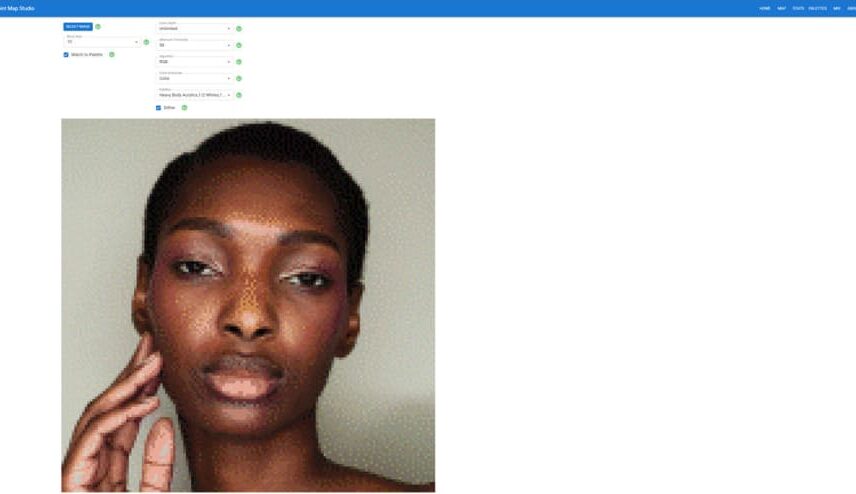
First, the user selects an image, along with a number of different parameters that determine exactly how that image will be transformed. The result is that you get a pixelated image that matches the colors in that image to a known set of colors from a palette of paints. The result looks like this:
In theory, the app will process images of any size. They could be small images that are easily viewed onscreen. But in practice, nearly all the images that I put through the app are fairly large. Most commonly, they’re 1440×1440 pixels.
This means that it can be difficult to view the generated image in its entirety. So when I’m using the app, I usually have my browser’s zoom function set to 75%. On my 4k monitors, this allows me to view the entire 1440×1440 image onscreen without having to scroll horizontally or vertically.
Another feature of the app is that it will then convert the transformed image into a huge “color map”. This is a massive HTML table where every cell in the table corresponds to one of the pixelated blocks from the transformed image. But on the map feature, each of those cells contains a number, and each number corresponds to a given color of paint.
(In case your wondering, the whole purpose of this feature is that I can then copy-n-paste the entire HTML table into a spreadsheet. Once it’s in a spreadsheet, I can then use it as a “paint by numbers”-style template.)
Unfortunately, converting the image into the massive HTML table makes the onscreen output even larger. This is necessary because if I try to adhere to the size of the original image, you’ll never be able to see all of the numbers in every individual cell.
So even with my browser set at a 75% zoom, the resulting display looks like this:
That may seem somewhat unwieldy because I still have to scroll horizontally and vertically to see the whole image. But this isn’t much of a concern because it’s all just gonna get copied-n-pasted into a spreadsheet anyway. Besides, when you’re viewing an image in this format that has 144×144 table cells, there’s only so much you can do to make it “presentable” on a single screen.
Adding clickable elements
Here’s the feature that I needed to add. When I was looking at the big “color map”, I found myself wondering: “How many other places on the map use the same color as the one that’s in this particular cell?”
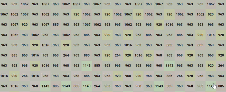
For example, when looking at the following section of the map:
I can see that there are certain blocks that use color #920. But I wanted to be able to quickly see, at-a-glance, where color #920 occurs in the entire color map. So I added some new logic to the code that renders the table cells. That looked like this:
const getTableCells = (cells = [rgbModel], rowIndex = -1) => {
   allow.anArrayOfInstances(cells, rgbModel).anInteger(rowIndex, is.not.negative);
   const { highlightedColor } = uiState;
   return cells.map((cell, cellIndex) => {
      const paintIndex = colors.findIndex(color => color.name === cell.name);
      const darkness = (cell.red + cell.green + cell.blue) / 3;
      let color;
      let backgroundColor;
      if (highlightedColor === cell.name) {
         backgroundColor = '#39ff14';
         color = 'red';
      } else {
         backgroundColor = `rgb(${cell.red}, ${cell.green}, ${cell.blue})`;
         color = darkness < 128 ? 'white' : 'black';
      }
      return (
         <td
            className={'cell'}
            id={cell.name}
            key={`cell-${rowIndex}-${cellIndex}`}
            onClick={handleCellClick}
            style={{
               backgroundColor,
               borderWidth: highlightedColor === cell.name ? 5 : 0,
               color,
            }}
         >
            {paintIndex}
         </td>
      );
   })
}
Here’s what’s happening in that function:
-
We grab the
highlightedColorfromuiState. -
Then for each cell, if that cell represents the
highlightedColor, we set the style to have a neon green background, with a red number, and a border width of 5. If it’s not thehighlightedColor, then we match the background color of the cell to the “normal” color, with a black number, and a border width of 0. -
We set an
onClickhandler for each cell that will update thehighlightedColor. -
We also set the
classNamefor each cell tocell.
The cell CSS class looked like this:
.cell {
    border-color: red;
    border-style: solid;
    cursor: pointer;
    font-weight: bold;
    height: 50px;
    min-height: 50px;
    min-width: 50px;
    text-align: center;
    transform-origin: 0 0;
    vertical-align: middle;
    width: 50px;
}
Notice that I’ve set the cursor attribute to pointer to give an extra visual cue that each individual table cell is indeed clickable.
And the handleCellClick() event handler looked like this:
const handleCellClick = (event = {}) => {
   allow.anObject(event, is.not.empty);
   uiState.toggleHighlightedColor(event.target.id);
}
The end result is that, if I clicked on any cell that contained #920, the previous subsection would look like this:
And if I zoomed way out, I’d get something that looked like this:
This allowed me to quickly see all the other places in the image that used the same color.
The zoom problem
At first, I was quite pleased with my new color-highlighting feature. But then I noticed something really wonky.
When I viewed the color map with no browser zoom applied, everything worked great. But viewing it with no zoom meant that I could only see a tiny portion on the screen. When I went back to my “normal” setting – browser zoom = 75% – something really strange happened.
Most of the onClick handlers worked just fine. But in some portions of the map, they did nothing at all. Also, for most of the table cells, the cursor: pointer CSS attribute was applied. But on all of the cells where the onClick handler was failing, the cursor also reverted to its default value of pointer.
I couldn’t find any rhyme-or-reason as to why the event/CSS values failed on some cells, but worked perfectly fine on others. Furthermore, the exact cells that failed-or-worked varied depending upon the particular zoom setting that I’d chosen in the browser.
At 75% zoom, a given region of cells would lose their event/CSS settings. But at 66% zoom, entirely different regions would lose the settings. I also noticed that, at 50% zoom, everything worked just fine. This was a critical clue as to what was happening.
The dangers of subpixel rendering
You may have noticed that, in most modern IDEs, if you try to manually set a CSS property to a subpixel value (e.g., height: 50.33px), you’ll get some kinda warning. They do this because browsers can get kinda wonky when you set pixel values that are not integers.
Of course in my example, I wasn’t manually setting any style attributes to subpixel values. Everything was set to nice, clean, whole numbers. But here’s the “gotcha”:
When the user manually alters the display with their browser’s zoom feature, it forces everything onscreen to be re-rendered. And those re-renderings will often turn your nice, clean, whole numbers into subpixel calculations.
For example, I was setting every table cell to have height: 50px and width: 50px. Nothing wrong with that. But if the user sets the zoom factor to 66%, now every cell height and width becomes 33.33px.
Now I’m gonna be honest here. I don’t fully understand what happens inside the guts of the browser itself that makes a table cell with height: 33.33px and width: 33.33px suddenly lose it’s CSS properties or its event handlers. But I was able to prove out through experimentation that those subpixel calculations were indeed the source of my problem.
This explains why, at different zoom levels, some regions of the color map performed just fine, while other regions failed. Because when you’re tiling successive table cells on the screen at, say, 66% zoom, the first cell will be “off” from the screen’s normal pixel grid (because of that pesky .33px modifier). And the second cell will also be “off” from the pixel grid (because now that one is essentially shunted by .66px). But the third cell will be able to “snap into” the screen’s normal pixel grid. Because by the time that the third cell is rendered, it’s “offset” is 1/3 + 1/3 + 1/3 = 1 – meaning that it can snap into the monitor’s “normal” display.
This also explains why my code worked perfectly at 100% zoom, and 50% zoom, but failed at zoom levels like 66% or 75%. Because, at 50% zoom, all of my height: 50px; width: 50px; cells became… height: 25px; width: 25px; cells – meaning that at 50% zoom, everything was still rendered with nice, clean, whole-number pixel dimensions.
The fix
Luckily, once I realized what was going on and I did a bit of CSS googling, I was able to solve the whole problem with a single line of CSS. I altered my cell CSS class by adding this:
transform: scaleX(1) scaleY(1);
This basically tells each cell to scale up to consume 100% of its boundaries. This in turn seems to clear the problem that the CSS-and-event-handlers had with subpixel-styled elements.
But… who cares??
It’s reasonable to look at this odd bug and wonder if you should even care about it at all. At first, I just filed it away as a weird edge case that I never ran into before – and I’d probably never need to worry about it again.
But… I’m actually pretty sure that I have run into this issue before. There have been times in the past when I was working on a site and I got tired of scrolling around to verify functionality. So I’d shrink the screen down so I could see it all in one shot. But then, after days, or even weeks, of using the site in this manner, I’d find some odd glitch in the app.
After investigating it further, and after realizing that none of my colleagues could reproduce the error, I’d realize that the issue only happened for me because I was the only one using the site on a non-100% zoom level. So what did I do? I just flipped my zoom back to 100% and went about my business.
Afterall, no one else had reported the error or was complaining about it in any way. So I didn’t want to burn dev cycles troubleshooting a problem that no one else cared about.
The only reason that I felt a need to fix the bug, in this particular case, was because it was important to me. Specifically, it “mattered” because it’s hard to view those large color maps onscreen unless I’m shrinking it down to a workable size.
Additionally, even if someone had complained in the past about features being broken in non-100%-zoomed formats, I’m pretty sure that I would’ve been fairly dismissive about it. It’s not that I don’t care about the user experience. But my reasoning would have been as such:
We spend a lot of time painstakingly ensuring that the site works optimally in its default resolution. If you feel compelled to change that resolution (for some odd reason), I can’t be bothered to test-and-troubleshoot every far-edge-case that results from people using the site in unintended ways.
Maybe that sounds flippant. But there are many things you can do/use in a browser that subvert the devs’ original intent. And we can hardly be expected to devote loads of troubleshooting time to your aberrant way of using the app.
For example: I’ve received “bug” tickets from users who said that something was broken on the site. When I investigated it further, I couldn’t recreate the error. Nor could anyone else on our team. When I contacted the user directly, I realized that the “bug” was caused because they’re using some third-party browser plugin. And it’s interfering with the site’s normal functionality.
In such scenarios, my answer has always been the same: Stop using that third-party browser plugin on our site. Sure, some people have whined about this response. But I’ve always received support in this stance from my management chain. Because trying to ensure that your app works properly no matter which third-party plugin someone chooses to use is a horrific rabbit hole that yields almost no discernible value.
Finally, issues caused by browser zoom functionality feel like extreme edge cases. I mean, 99.99% of the time when I’m viewing/using any website, I’m viewing/using it at the default 100% zoom level. For the vast majority of users out there, they probably use most/all sites at the same 100% zoom level as well.
An accessibility issue
But the more I thought about this, I began to realize this is an accessibility issue. And it’s one that I don’t think many dev teams are really thinking much about.
I’ve worked on apps where accessibility was no one’s real concern. We had a limited userbase and management put no priority on accessibility standards. So we happily cranked out code without worrying about things like A11Y compliance.
I’ve also worked on teams where accessibility was a critical concern. In those shops, we constantly ran auditing tools and preached the importance of accessibility standards in everything we built.
Even in those “woke” environments, I don’t ever remember anyone saying that we needed to validate the site’s features at different zoom levels. But what subset of your userbase is most likely to be using your site/app at varying zoom levels? That’s right. People with impaired vision. And if key features of your site simply break at, say, 125% zoom, you could be alienating those users.
To be clear, I’m not even sure exactly how you test for this. Like, if you’re writing Jest unit tests, you won’t be able to validate functionality at different zoom levels. You’d need to leverage a headless browser solution. And I’m not sure if quick auditing tools (like Axe) even check for these things? I’ll have to research that some more.
At any rate, I’m not trying to upend your current accessibility practices. And to be honest, maybe in your dev shop, this isn’t even something that’s on your radar. But I’m just highlighting it as one potential issue that you may need to keep in mind going forward.
Cheers! And happy coding.
