Obligatory (my editor made me add it) Disclaimer 😉
All scenarios presented in this article are intended purely for humorous purposes and reflect the personal opinions of the author. The intention is not to offend anyone or specifically target real situations or projects. Any resemblance to actual events or projects is purely coincidental.
Intro
Are you familiar with that feeling when you come across a design that immediately triggers a cascade of expletives in your mind, making you question every decision that brought you to that particular moment? No? Well, consider yourself fortunate. Certain design practices have the uncanny ability to evoke such reactions from front-end developers. Regrettably, encountering one of these design challenges in a project often implies a high likelihood of encountering more. In this article, we will delve into the realm of designs that pose significant obstacles during development. Brace yourself for an insightful journey into the world of frustrating design choices. Let’s embark on this adventure together!
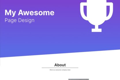
Diagonal lines
Let’s dive into a common predicament that many web developers face, regardless of their experience level. CSS, known for its love affair with rectangles, tends to make life difficult when it comes to anything else. You can squeeze out some rounded corners if you’re lucky, but anything beyond that requires delving into the realm of hacky solutions. And that’s exactly what we’re about to explore. Picture this: a well-intentioned designer decides to spice things up with a “dynamic” and “interesting” divider between different sections of a website.

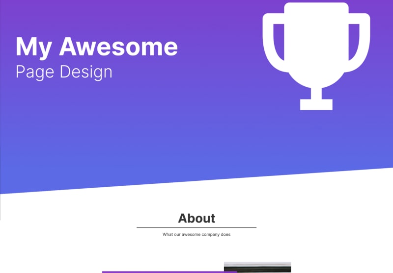
There are numerous approaches to tackle this problem, but my personal preference would be to employ an SVG triangle, as demonstrated in the illustration below. Implementing this solution isn’t overly complicated, but how should it behave when scaling the browser? This crucial consideration should be in every designer’s mind when creating any application element. Should the triangle maintain a fixed height or scale down accordingly? How will it affect the elements positioned below it? These are the pivotal questions that must be addressed in the design notes if the designer chooses to incorporate this element.
Floating elements
I can’t count how many times I had to deal with this one. Picture this scenario: the designer sees a bit of empty space on the page and starts thinking: “How can I make it more interesting?”, after exactly 0.01 seconds he figures it out: “Let’s add some floaty stuff and make the devs hate me!”.

I hate them so much 🥲 Those things are impossible to make them responsive. Usually, I just implement them on desktops, pray that they work on all the desktop screen sizes and completely remove them on mobile and tablets.

Inconsistent components
Here is another scenario. Your team has dedicated an entire week to diligently implementing the sleek and modern form components meticulously crafted by your designer. As the next sprint kicks off, you eagerly await the designs for a new contact page, only to be greeted by a jarring sight. The designer, seemingly in a quest for uniqueness, has opted for completely different components on this particular page. Faced with this situation, you have two possible routes to take:
- Take a break to cry in the toilet and implement a second set of components to confuse the rest of the devs working on the project
- Try to persuade the designer to use the already implemented elements, fail at it and finally go with route no. 1
Untranslatable design
Here’s another familiar scenario that frontend developers often encounter. Imagine you’re working on a multilingual page, and everything seems to be going smoothly with the design in the English version. However, as soon as you delve into different languages, the trouble begins to rear its head. Take a glance at the design above: a visually appealing offset image positioned behind a text box. Yet, when you switch to a language with more condensed text, such as Chinese, or one with wider text, like German, things start to appear a bit off.
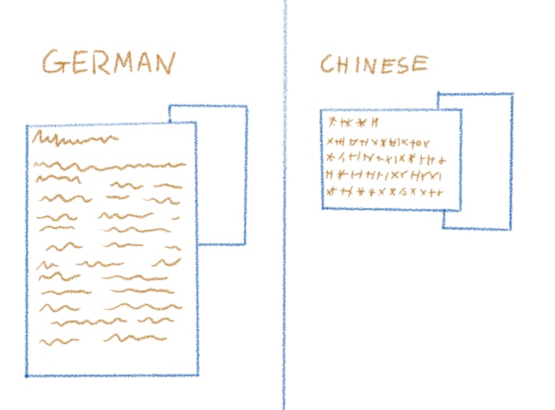
So, how can we address this issue effectively? Well, the key here is open communication and collaboration with the designer. It’s essential to consult with them and discuss potential solutions. And here’s the twist: we might just need to make those delightful language-specific adjustments. Oh, the joy of adding complexity and messiness to our code! Who needs streamlined and clean code anyway, when we can have a tangled web of exceptions? However, by actively collaborating with the designer, we can find the right balance between accommodating different languages and maintaining code cleanliness. Together, we can navigate these challenges and ensure that the design looks fantastic, regardless of the language used.
Ending notes
One of the fundamental aspects of working with designers is creating a collaborative environment and ensuring a seamless exchange of ideas and experiences. As a programmer involved in a project, it’s crucial to actively participate in the design process. By providing thoughtful notes and explaining your reasoning behind them, you can save valuable time by avoiding the need for extensive revisions or complicated design implementations. It’s important to acknowledge that as a developer, you may not always have the final say in design decisions. After all, applications are built for users, not for developers. Keeping this perspective in mind will help foster a user-centric approach and ensure the ultimate success of the project. Remember, effective collaboration and embracing the user’s perspective are key ingredients for creating remarkable applications!
The example design used in this article is available here: Figma Design. Send it to all your designer friends to either teach them something or just have a laugh! Those are only some of the annoying elements to code. Are you interested in learning more? Let me know in the comments because believe me, I have a lot more of them…