Today I would like to show how you can build a simple application shell layouts with a sticky sidebar, navbar and main content area using Tailwind CSS and the Flowbite Library.
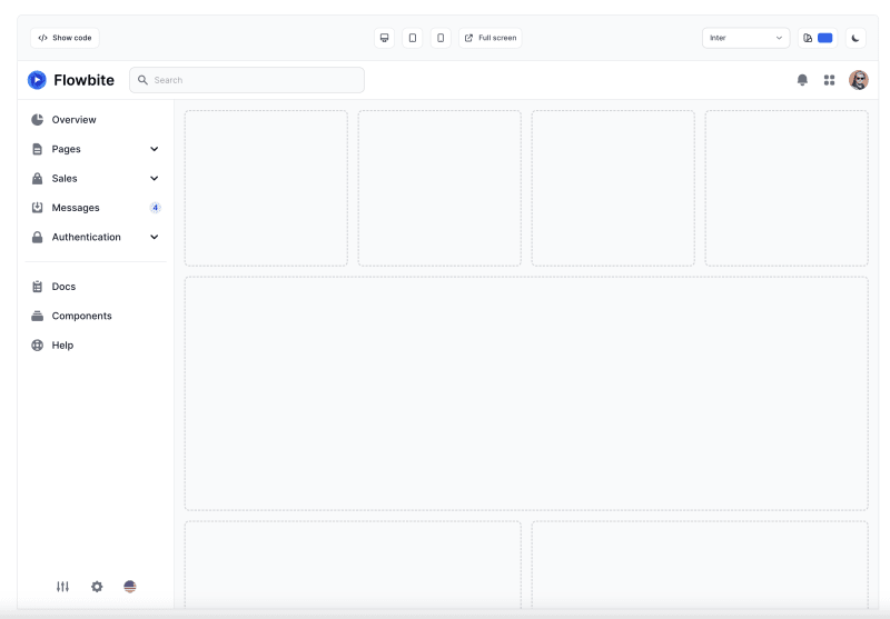
Here’s a preview of what we will build:
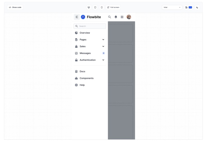
We’ll also make sure that this interface is nice and responsive:
We will use the utility classes from Tailwind CSS and the interactivity and base UI components from Flowbite.
Without further ado, let’s get started!
Building an app shell layout
The first thing that we need to do is set up the base layout which is the sidebar, the navigation bar and the main content area.
As we will use Tailwind CSS it will be fairly easy to set up the layouts directly from HTML. In order to make things easier, we are going to check out the following two resources for navigation bars and sidebars:
Based on this it’s going to be fairly easy to set up the layouts using simple margins, paddings and CSS grid layout.
By taking one of the first sidebar examples and taking one of the navigation bars we can quite easily create our application shell layouts by just copy and pasting these components:
Making the elements interactive
In order to make the elements such as the navbar, sidebar and the dropdowns interactive you will have to install Flowbite in your project.
Getting started
Flowbite can be included as a plugin into an existing Tailwind CSS project and it is supposed to help you build websites faster by having a set of web components to work with built with the utility classes from Tailwind CSS.
Install using NPM
Make sure that you have Node.js and Tailwind CSS installed.
Install Flowbite as a dependency using NPM by running the following command:
npm install flowbite
Require Flowbite as a plugin inside the tailwind.config.js file:
module.exports = {

    plugins: [
        require('flowbite/plugin')
    ]

}
Make sure that you add the template path to the tailwind.config.js file:
module.exports = {

    content: [
        "./node_modules/flowbite/**/*.js"
    ]

}
Include the main JavaScript file to make interactive elements work:
Include via CDN
The quickest way to get started working with Flowbite is to simply include the CSS and JavaScript into your project via a CDN service such as UNPKG or CDNJS (content delivery networks).
Require the following minified stylesheet inside the head tag:
href="https://cdnjs.cloudflare.com/ajax/libs/flowbite/1.6.5/flowbite.min.css" rel="stylesheet" />
And include the following javascript file before the end of the body tag:
Now that you have the application shell layout HTML and classes and Flowbite installed in your project then the layout should work an be responsive as well.
Dark mode
The good news is that the components from Flowbite support dark mode by default so by checking out the dark mode guide for Tailwind CSS you can learn how create the theme toggle.
Here’s how it should look on dark mode:
Conclusion and credits
I hope that you liked this article and resource and I recommend you to check out the Flowbite Library for more components and the app shell layouts for more advanced examples and support for Figma.
Credits for Tailwind CSS and Flowbite for the resources for this article and tutorial.
